Brew & Que
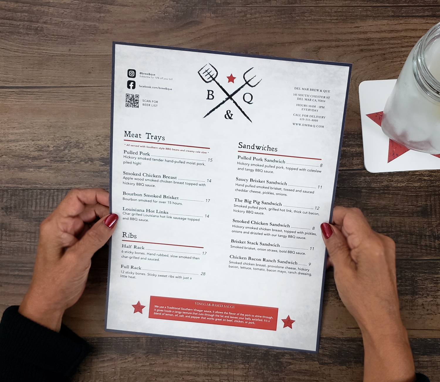
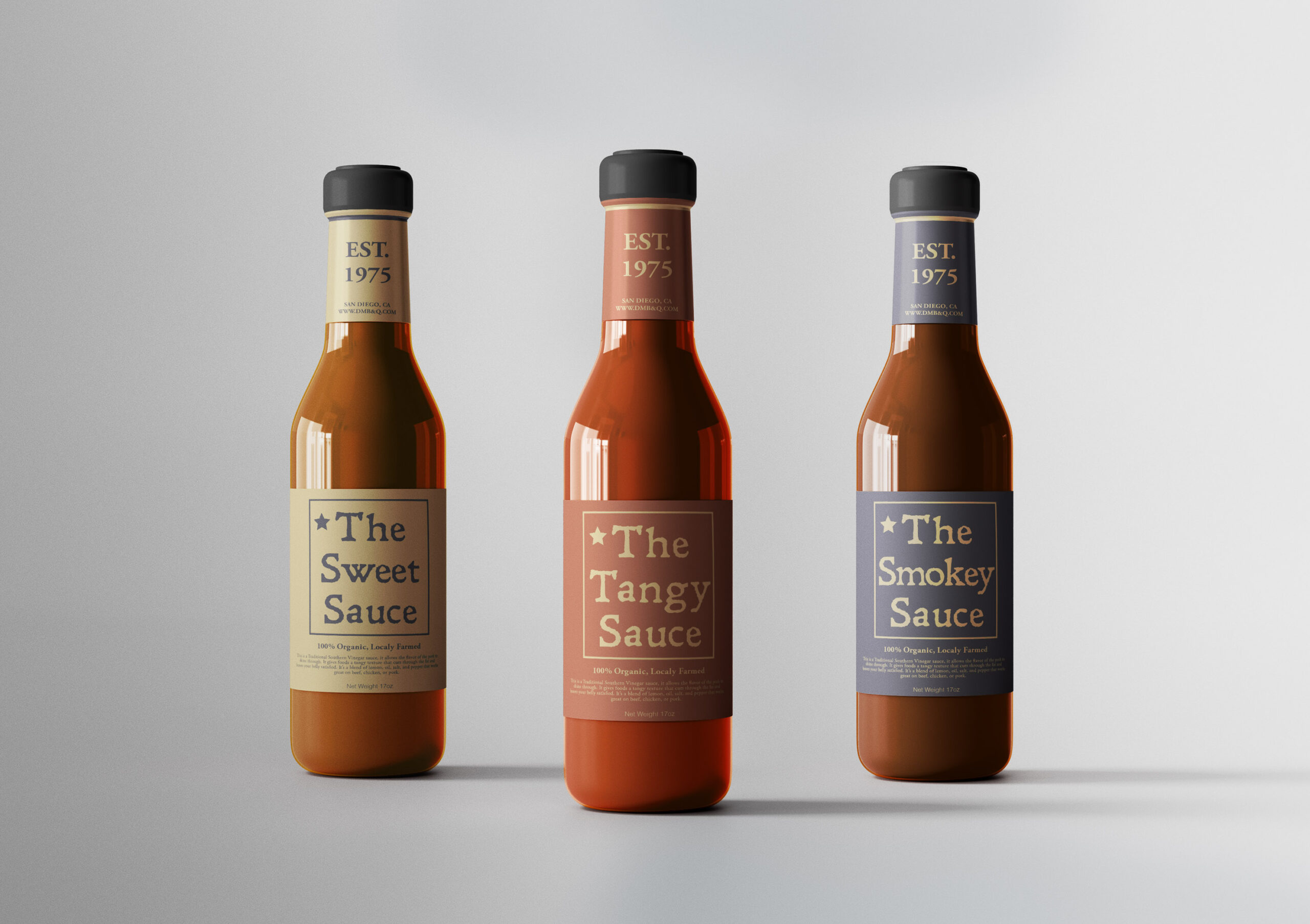
This project was a combination of Americana color and style, with the gritty grunge of BBQ cooking. The influence came from my years of enjoying North Carolina vinegar-based barbeque. As a Californian, I imagined what a Southern food-style BBQ place would be like in San Diego.
The development of the style had to start with the color pallet, the gritty black grill marks had to be at the forefront thus the grunginess of the logo. The colors red, blue, and yellow come from the NC flag, I found it was not only a tribute but the colors are iconic for an Americana style. From that point, the style became a mix between Americana, southern cooking, and southern California.
Category Branding
Industry Restaurant
Typefaces Leander, Garamond, Avenir
Date December 2021
Instructor Sean Bacon
Course Page Layout ARTG124


Contact