
Libations
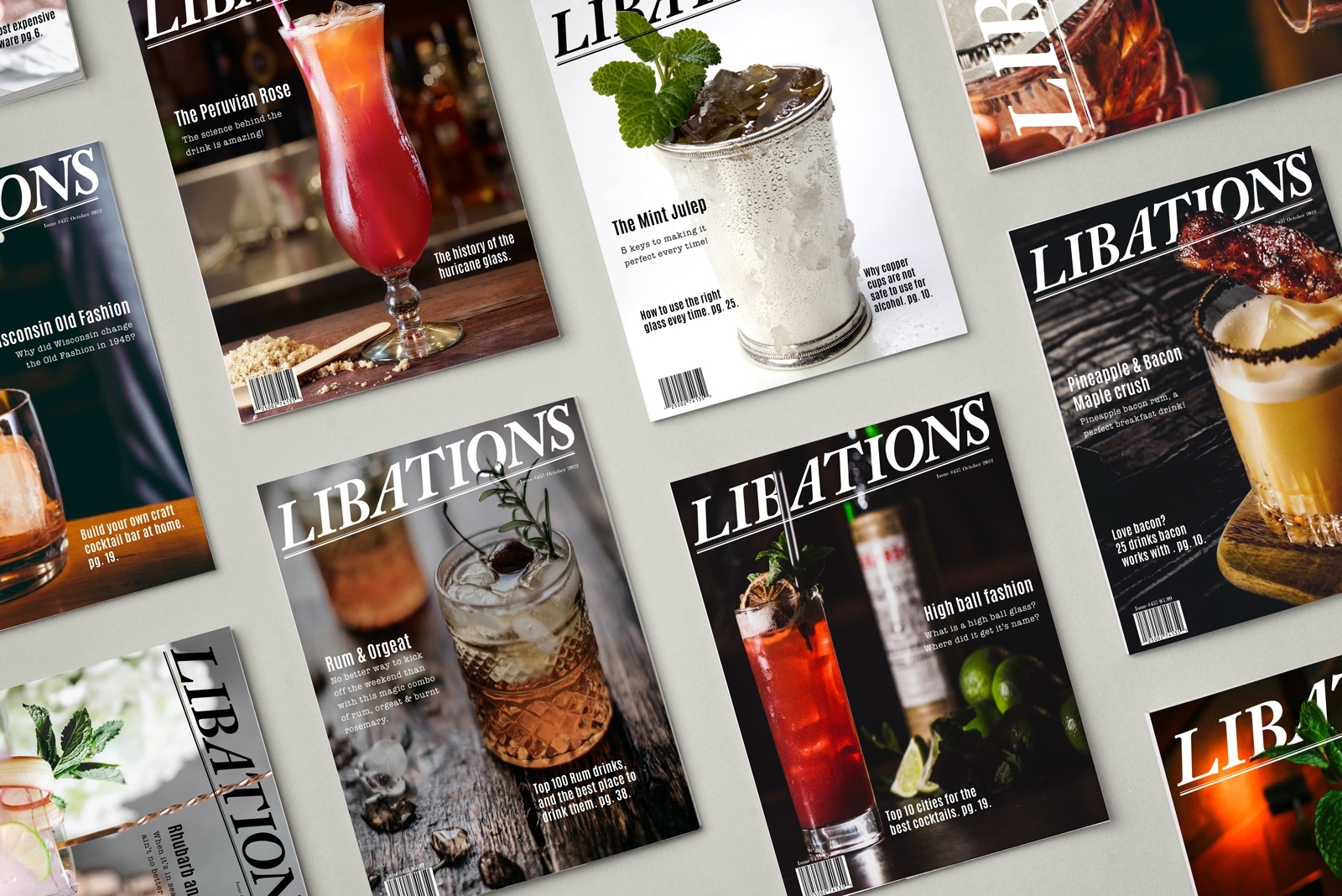
The magazine logo was placed at a slight angle to give the word "libations" the feeling of an announcement or a call to get your drink. Craft beverages have been making a comeback and more and more elegant craftsmanship has come to light, I wanted to create a magazine that showcased the beautiful photography and interesting new establishments in this new ever-growing industry. Every edition of the magazine's cover image interrupts the logo somehow, maybe it's a straw or a garnish, but some part cuts through the logo. This was a fun project and working in the magazine realm of design has been something I have done professionally. Many logo variations were tested and in the end, I liked a classic serif font, I felt it added a sense of sophistication.
Category Magazine
Industry Publishing / Advertising
Typefaces Antonio, American Typewriter
Date March 2022
Instructor Sean Bacon
Course Advanced Typography ARTG 206


Contact