Coastal
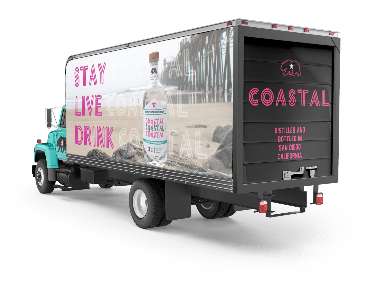
My Inspiration came from the west coast beach scene, from surf to skateboarding, and bonfires, to beachside dining. I wanted to bring different elements that everyone would recognize. In creating a brand for a California rum I considered some of the most important icons that represent California. The bear, star, and the sans serif font all came from California the state flag.
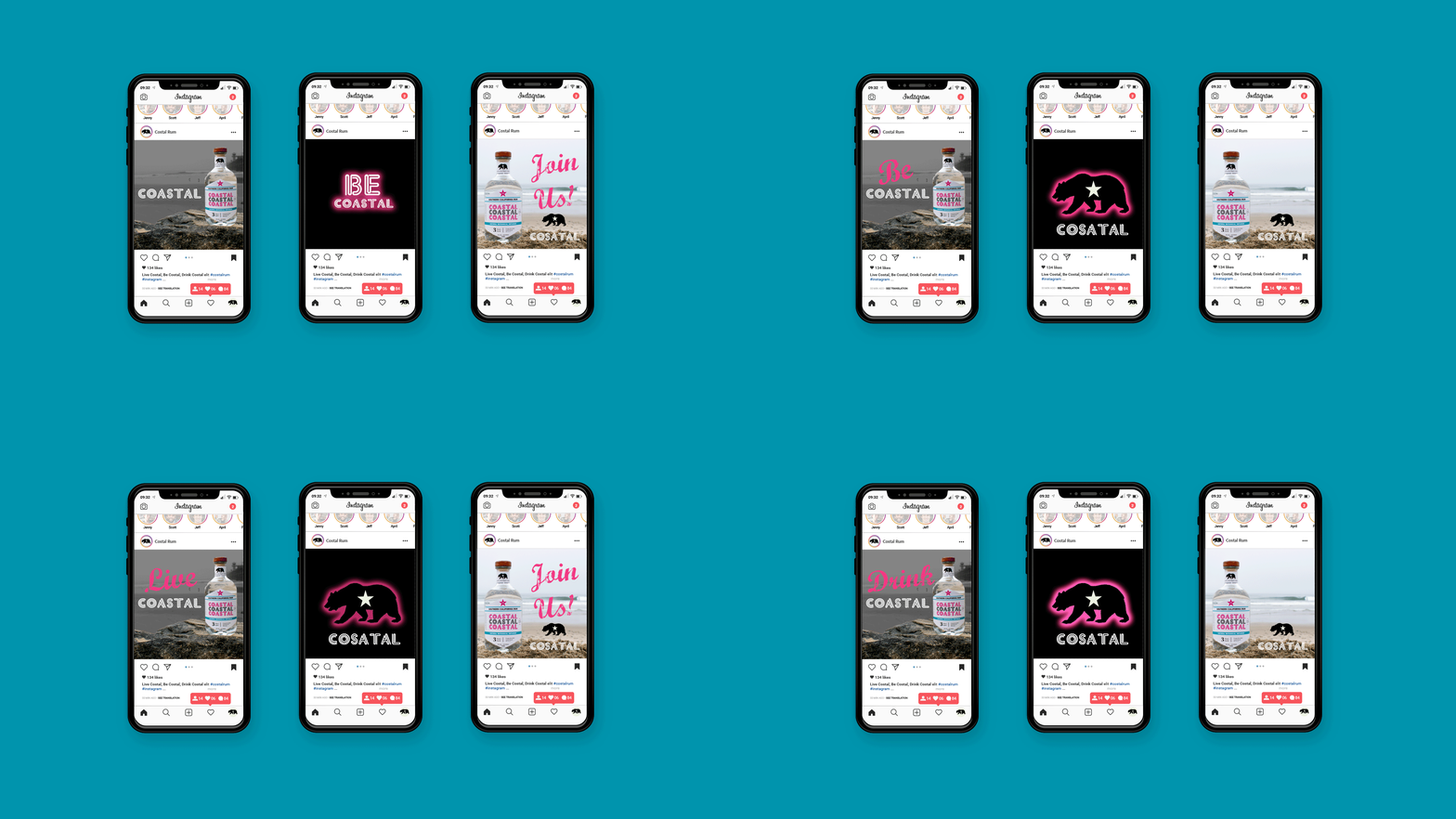
Next, the brand needed to represent the flavors that the west coast has to offer, like fresh citrus, tropical florals, berries, and grapes. With the boom of infusion, I chose to represent the flavors with a bright neon color to not only make it stand out among the other rums on the shelf but to represent a younger audience looking for something different. The neon style font in the logo was intended to remind you of neon signs and grab your attention while rums alongside it use flat brown-paper-bag labels with black type.
Category Product Label Branding
Industry Rum Company
Typefaces Elektron, Franklin Gothic, Bodoni
Date March 2022
Instructor Sean Bacon
Course Advanced Typography ARTG 206


Contact